Friday, 31 January 2014

Moderator's Message

Hello Moderator,
I have tagged each one of my posts to its own appropriate label i.e. Evaluation, Production, Research and Planning. Therefore making it easier for you to find. The label widget is on the right-hand side of my blog. I have also added a picture with a link on the top right-hand side of the blog that will take you back to the moderation hub. Thank you for taking time to look at my blog, hope you enjoy viewing my work :)

Take care

Friday, 6 December 2013

Evaluation 4


4.How did you use new media technologies in the construction and research, planning and evaluation stages?


Thursday, 5 December 2013

Evaluation 3

3. What have you learned from your audience feedback?

Wednesday, 13 November 2013

Evaluation 1

1. In what ways does your media product use, develop or challenge forms and conventions of real media products?
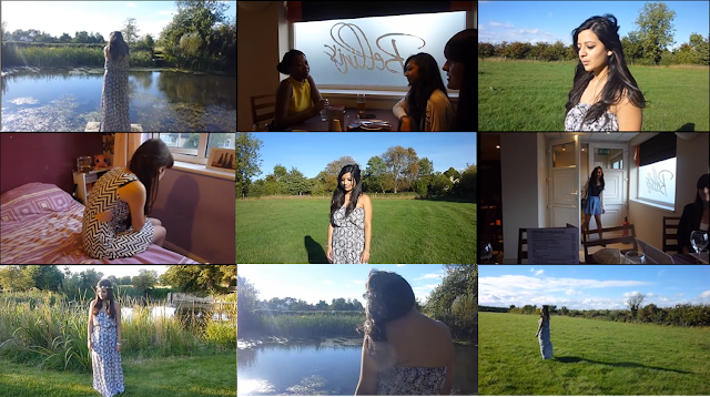


The first frame represents the setting used in my music video. Although throughout my video I used several different settings, the one shown in the first frame is consistently shown. I chose settings that represented the artist, chosen genre and narrative effectively. The first setting shown in the video is the field area with a pond, trees, bushes, etc. I decided to use this as the location because it represents my artist and her music successfully. For example the field is natural and symbolises a creation that is non-man made, this what my artist is she has a natural voice that easily flows and isn't overly produced. I chose this setting because it just focuses on the artist and nothing else, letting the audience know that she is the main focus and its her video. This is conventional to music videos of the Pop genre since Pop artists usually attract all of the audience's attention.The other settings I used was a restaurant, a bedroom and outside the cinema. The reason why I picked them is because they fit with the narrative of my video. As the narrative of the video is several girls being stood up by their boyfriend I selected stereotypical date places e.g. a going to the cinema. 

The second frame is for the costumes and props. In the frame the girl and her two friends are having dinner at a restaurant. To make this scene seem more realistic I used props which are conventional to dinners e.g. glasses, tables, chairs, napkins, cutlery etc. The costumes I chose for this scene are casual/dressy as this is usually how people dress when eating out. My artist wore a floral maxi dress in every shot she was in, thus coordinating with the nature theme.The other two girls who were also stood up wore outfits that were suitable to where they were. For instance the girl who waited for her boyfriend outside the cinema wore a large parka coat as it was cold outside. Whereas the girl who was getting ready for her date was firstly wearing an over sized jumper and leggings but then later changed into a dress. All the costumes used were conventional to the Pop genre as they fit with current fashion trends.

The third frame is performance. In the performance shots I wanted my artist to be the main focus, this is why I used a very simple yet beautiful setting. By using performance shots my video is conventional to the chosen genre Pop as other Pop videos also use performance shots with just their artist lip-syncing.This is why I think I successfully fitted the performance shots within the Pop genre. 

The fourth frame is for narrative. There are three narratives with a similar storyline used in the music video. The first narrative is a girl is out to dinner with her friends and is waiting for her boyfriend to arrive but her never does. Similarly in the second narrative the second girl is outside the cinema waiting for her boyfriend when she receives a text from his cancelling at the last minute. In the last narrative the third girl is getting ready for a date in her bedroom just as her boyfriend texts her saying he can't make it. All three narratives interlink at the end of the video when they later get a phone call from their boyfriends and decline the calls. I used these three narratives as they reflect well on the meaning of the song 'The moment I knew' that I chose for my video. They also have a theme of love and heartbreak which is conventional to the Pop genre. 

The fifth frame is genre and how the music video suggests it. I included both performance and narrative shots in my video as it is conventional to Pop music videos. The costumes were also conventional as they were all part of current fashion trends e.g. the maxi dress. Furthermore in Pop videos the artist is always the focal point as it is their song, for this reason I made sure to make my artist the main focus.

The sixth frame represents how the characters are introduced. My main artist is introduced in the first shot, although her back is to the camera the audience would still be able to recognise her as the artist as she is already an established artist. The second character and her friends are introduced after a performance shot with the artist lip-syncing. This is so that the audience are not confused with who the artist is. The first girl is introduced in a long shot where she opens the door to the restaurant with her friends waiting for her. I decided to introduced her like this directly after the performance shot during the line 'you burst through the door with that baby I'm right here smile' as it links in well with the lyric. I think that by doing this the music video seems more professional as the song and video actually interlink with each other. Her friends are then introduced in the same shot greeting the girl with hugs. The second girl is introduced in a medium shot walking up towards the cinema and the third girl is introduced in medium/close-up shot staring out the window. 

The seventh frame is the representation of the artist. In the majority of the Pop music videos the artist is represented through the use of the costume and the way she acts in the performance shots. Similarly I chose a floral maxi dress for my artist to wear as it is a current fashion trend, meaning that its also conventional. Furthermore it effectively represents who my artist is, as dresses are normally worn by the stereotypical female. The floral pattern denotes vulnerability and a gentleness that my artist possesses. I also represented my artist by using a variety of shots and making sure that she is consistently in centre composition, so that the audience understands that she is the focal point.    

I didn't use any special effects in my music video as it wouldn't have been appropriately worked with the song or narrative. Although some Pop music videos do use special effects not all of them do, therefore I am not challenging the Pop genre. 

The ninth frame represents camerawork and editing. Throughout my music video I used a variety of shots to capture the narrative and represent the artist effectively. By doing this I am fitting in with Pop music video conventions and making my video appear professional.


Thursday, 26 September 2013

Audience Feedback: Advert

1.Does the advert fit within your chosen genre?
  Most of the audience agreed that the advert does fit within the Pop genre because it shows
  the artist, her name and the album title clearly. Also they said that the floral pattern used is
  currently a trend, this fits within the Pop genre as it is short for Popular and involves
  current trends.

2.Does the advert create the meaning you intended?
   The meaning I intended for the advert is for the artist to be the subject of the entire advert 
   and the focus to be on her. The audience noticed that there was recurring theme with the
   floral pattern in both the advert and digipak to link them together.

3.Does it target your audience?
  The audience agreed that the advert does target my audience of teenagers as the artist
  herself is a teenager. This would make her relatable to other teenagers so they would
  enjoy her music more.

Audience Feedback: Digipak

1.Does the digipak fit within your chosen genre?
 The audience agreed that my digipak does fit within my chosen genre as it displays my
 artist, her name and the album title clearly. They also commented on that the colour
 scheme used on both the front and back cover is bright and colourful, thus fitting in with my
 genre.

2.Does the digipak create the meaning that you had intended?
   The digipak shows a stereotypical female artist throughout appearing to be vulnerable and
   fragile, the imagery also hints towards the sound of the album. Comments I received
   showed that the audience acknowledged the theme throughout the imagery. They also
   understood the reason why I decided to use a floral theme for the digipak i.e. its a
   convention of a stereotypical female. Also it matches current trends therefore fitting within 
   the Pop genre, which is to do with popular culture.


3.Does the digipak target you audience?
  The target audience for my artist is teenagers, the audience realised this because the artist
  herself is a teenager. They said that it does target the audience because of the use of the
  floral pattern and bright colours and it aims towards females more.

Audience Feedback: Editing

1. Does the editing fit within your chosen genre?
   The audience all thought that the editing in my music video does fit within the Pop genre
   as it is simple and fits with the song. However they said that there should be no space
   between the scenes and it should just go from on cut straight to the next. After listening to
   their comments I decided to re-edit my video to ensure there were no gaps between the
   cuts.

2.Does the edting create the meaning you intended?
   The meaning I wanted to create through the editing is simplicity as I didn't want to draw
   attention away from the narrative of the video. The audience noticed that I edited my
   narrative in order so it would be easy to understand whats happening.
   

Audience Feedback: Mise En Scene

1. Does the mise en scene fit within your chosen genre?
    The majority of the audience thought that the mise en scene in my music video does fit within my
    chosen genre Pop. For example they state that in the performance shots my artist is alone in a
    simple location so that the attention is solely on her. This is a convention for performance shots in
    Pop music videos.

2. Does the mise en scene create the meaning you intended?
     In my music video I wanted the mise en scene to reflect on the narrative and artist throughout. For
     example the location that I chose to use for the performance shots is a field; this location
     represents my artist and the song well as she has a natural sound that easily flows. The audience
     noticed the location I chose isn’t flashy or modern instead its simple suiting my artist and
     represents who she is.

Audience Feedback: Costumes

1.Does the costumes used fit within your chosen genre?
   My chosen genre for my music video is Pop therefore the costumes have to fit
   conventionally within this genre. I asked the audience this question and they all thought
   that it did fit within the Pop genre because the costumes in the video are trendy right now
   and that is a convention of the genre. For example in the video the artist is wearing a floral
   printed maxi dress that is currently in trend.

2.Does the costumes create the meaning you intended?
   The meaning I intended with the costumes is for the audience to perceive my artist as
   feminine and girly because this is how her music would sound. The feedback I received
   from the audience suggested that they noticed that I did this and why I did this.

Production Log: Editing Ancillary Tasks

Are you on schedule?
Yes I am on schedule as I have already completed both digipak and magazine advert.
 
How is it going?
The editing of my ancillary tasks is going well as it is fairly simple to do once you understand how to use the editing programme. The programme I am using to edit my ancillary tasks is Photoshop. An advantage of using this programme is that there is a wide variety of tools I can use to make the editing process much easier. A disadvantage is that at first it is difficult to understand what to use as there are so many different tools.
 
Font choices? Where did you get them? Why have you chosen them?
I wanted to the font to stand out in my ancillary task so I used black to ensure that it is visible enough for the audience to see. I used two different fonts in my ancillary tasks. One font was for the album title and artist's name, whilst the other was for the other text such as the tracklist etc. The font used for the tracklist was slightly feminine to match the the girly theme that is used throughout the digipak and magazine advert. Whereas the font used for the album title was large and bold to capture the audience's attention.

Production Log: Editing Music Video

Currently I am on schedule editing my music video as there haven't been any difficulties occurring for me to fall behind. The programme I'm using to edit the video is an update version of Adobe Premiere Pro. An advantage of using this programme is that it allows me to apply several different effects onto my video e.g. split screen, colouring, transition effects etc. However the disadvantage of Adobe Premiere Pro is that it automatically zooms into your footage if the sequence frame settings and the footage frame settings do not match up.

Production Log: Filming

 I first filmed all the performance parts of my music video i.e. the artist sing to the camera. Initially my artist was going to be in both the performance and narrative parts, but as she was unavailable to film the narrative I used a different girl be the main actor. Then I filmed all the narrative parts without any complications. However when I started editing I realised that I didn't have enough footage for a four and a half minute video without dragging the narrative. As a result I had to film two more narrative parts for my music video, both with the same experience as the first narrative but in different situations. 

Wednesday, 12 June 2013

20. Equipment

Tripod


For some of my scenes I will be using a tripod as this stops any shakiness and gives a perfectly still shot. Thus making the shot seem more professional and appealing for the audience to watch. Although some videos deliberately don't use a tripod to give the more natural effect and add meaning from the song to the video.

Camera and memory card


Another piece of equipment I will be using is a camera. The camera will film all the different shots and movements that make up my entire music video. I am going to be using a good quality camera so that my video doesn't appear to be amateurish. Alongside my camera I will be using a memory card to store all my video clips in, that I will later edit and produce my final video.

19. Costumes


The main artist's costume


18. Props

17. Locations


Below I have embedded maps of the locations I have used to shoot different parts of my music video.


View Larger Map
View Larger Map

16. Casting Actors

Main Artist


I have chosen Sapna to be my artist in the music video as I think she fits within the conventions of a Pop artist. She is slender, has an average height and long wavy hair. This can be all found as attractive to some people, therefore making it easy to sell her as an artist as she has the whole package. The reason why I chose Sapna is because her look suits the song I have chosen for the music video. The song is quite feminine with a soft sound that flows easily, matching with Sapna's look.


Extras
Alongside my artist Sapna there will be several extras acting as diners in the restaurant scene. They will be a variety of ages and types of people that would usually go out for dinner at a restaurant. For example, families, couples, groups of friends. With Sapna there will be a few girls with her acting as her friends. The friends will be of similar age and style but different ethnicities. This will appeal to a wider audience as it isn't relatable to just one type of person or ethnicity.

15. Shooting Schedule

3/9/2013
Shot 1
Location- Field
Character- Sapna
Shot Length- Long shot

3/9/2013 
Shot 2
Location- Field
Character- Sapna
Shot length- Medium Shot

22/9/2013
Shot 3
Location- Restaurant
Character(s)- Main girl, extras
Shot length- Medium Shot

22/9/2013
Shot 4
Location- Restaurant
Character(s)- Main girl, extras
Shot length-Close up

3/9/2013 
Shot 5
Location- Field
Character- Sapna
Shot length- Long Shot

22/9/2013
Shot 6
Location- Restaurant
Character(s)- Main girl, extras
Shot length-

3/9/2013
Shot 7
Location- Field
Character- Sapna
Shot length- Long shot

3/9/2013
Shot 8
Location- Field
Character- Sapna
Shot length- Medium Shot

22/9/2013
Shot 9
Location- Restaurant
Character(s)- Main girl, extras
Shot length- Over the shoulder Shot

22/9/2013
Shot 10
Location- Restaurant
Character(s)- Main girl, extras
Shot length-Long Shot

3/9/2013
Shot 11
Location- Field
Character- Sapna
Shot length- Medium Shot

22/9/2013
Shot 12
Location- Restaurant
Character(s)- Main girl, extras
Shot length-Long Shot

3/9/2013
Shot 13
Location- Field
Character- Sapna
Shot length- Extreme long shot

14. Storyboard


13. Magazine Advert Planning


In both magazine advert drafts I used a picture of my artist to introduce her and her album to the audience. On the adverts in large block lettering is the artist’s name and the album name, this is to inform the audience what the advert is about. There is also a picture of the album to show the audience how it looks. To make the advert look professional I have also made sure to include critic reviews, and puffs to put the album in a positive light.

The draft I have decided to use for my final magazine advert design is the first draft. This is because the picture in the first draft is similar to the picture I have chosen for the front cover of the digipak, using this picture will help the audience draw a link between both digipak and magazine advert. Furthermore the layout of the first draft is nicer to look at as it is more spread out, instead of being crammed to one side like in the second draft.


12. Digipak Planning

After creating two drafts for my digipak I have decided that for my actual digipak I am going to merge the two drafts together. By using ideas from both drafts I will hopefully be able to create a conventional, professional looking digipak. For instance I am going to the use the picture of the artist from the second draft but then use the floral print as the background for both the front and back cover. The reason why I have decided to do this is because the picture from the second draft suits the background more than the picture in the first draft as it is very subtle.


1st Draft


 2nd Draft


11. Similar Videos/Texts

10. Lyrics Planning

9. Initial Ideas

8. Editing and Cinematography for Music Videos


Reflection
The trial music video went well as we had enough footage to test out different teachniques and effects throughout. Whilst I was editing the video I learnt how to do several different effects such as split screen, black and white, reverse, and how to change the speed setting of the video. This is because in our trial we shot our video in slow pace and fast pace so that when we edit it the video it will come out sharper and more professional. Although I have learnt many different techniques I don't think I will be using any in my video as it wouldn't fit well with the theme of the song or the narrative.

7. Theories for Production


6. Magazine Advert Analysis


Reflection:
This task has been helpful in creating an idea of what should be included in a magazine advert. I also gained understanding of different components such as costume, scenery, font, that are used within the advert which represent the artist's genre clearly. For example a Pop artist would incorporate the latest trends somehow within the advert e.g. through costume, scenery. From completing this task I know that the composition of my artist is going to be in the center and I will the conventions of a magazine advert e.g. release date, album title, artist name, website etc.


5. Digipak Analysis

Monday, 10 June 2013

4. Record labels and permissions


The image shown above is the logo for my record label 'Bubblegum Records'.


 This is a screenshot of the letter I have sent to 'Big Machine' records requesting to use the song 'The moment I knew' by their artist Taylor Swift.

Saturday, 8 June 2013

2. Genre Music Video Analysis

L.O: To analyse a music video for the meaning produced by media language.